
How I Work
What My Apps Look Like On The iPhone Duo
The iPhone Duo ships on 23 October. Apple announced it on 9 September, the simulator showed up shortly after, and last night I did the obvious thing: started working through everything I make to see what fell over.
Short version — one of them looks great, one of them is broken in a way I would not have guessed, two of them are websites and will be fine, and one of them is not a phone app at all. Here is what I actually found, with the screenshots, because a “we’re ready!” post with no evidence is worth nothing.
The Cover Screen Is Not Where You Think It Is
Here is the thing that caught me out. On the folded 5.4‑inch cover display, the clock and the wifi indicator do not sit in a bar across the top. They sit in a vertical strip down the right‑hand side.
I spent a genuinely embarrassing amount of time convinced this was my own app rendering wrong, because it looks exactly like something has gone sideways. It isn’t. Every app shows it, because that is simply where that screen keeps its status indicators. If you are building for this thing, that is the assumption to check first — not orientation, not scaling. The safe area is on the side.
Love You Bye: Nearly Perfect
Love You Bye came up beautifully. The map fills the entire width of the cover screen, the type is the right size, nothing is stretched or letterboxed. That is the left‑hand screenshot above and I was pleased with it for about a minute.
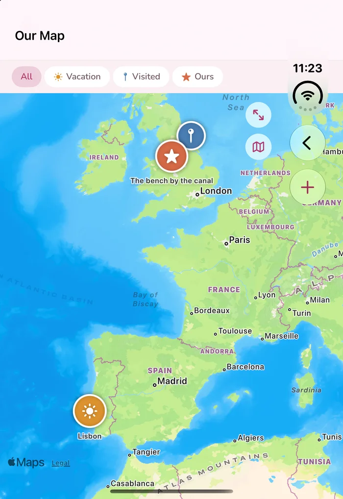
Then I looked at where its back arrow and its + button had landed: directly underneath the status strip, sharing space with the clock. It is drawing into the full width without reserving that right‑hand edge, so two of its controls sit behind system indicators. On a store screenshot that reads as a glitch. On a real device those are awkward taps. It is a small fix and it is on the list.
Kirby: Inset And Wrong
Kirby, my mail client, is the right‑hand screenshot. It runs, it does not crash, the mail is all there — and it stops about 1,130 pixels into a screen that is 1,398 wide, leaving a black band down the side. It is not claiming the display it has been given.
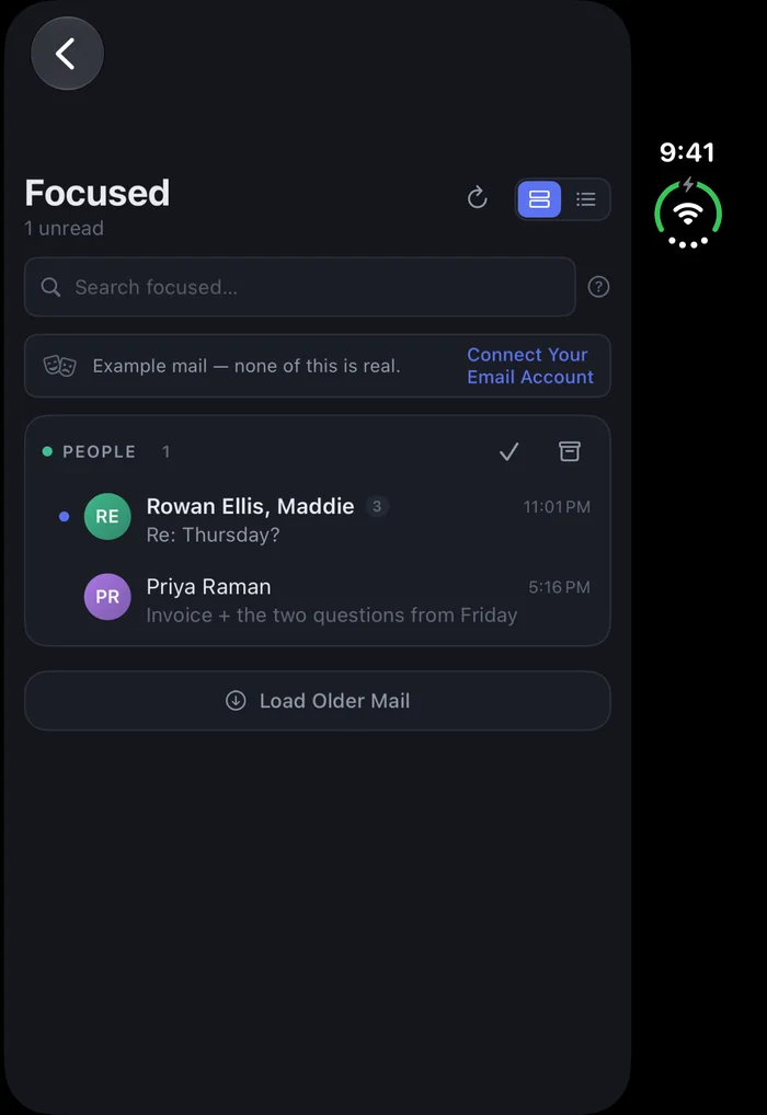
My first guess was orientation, because Kirby supports landscape and Love You Bye does not. I rebuilt it portrait‑only to check. Made no difference at all. So that is still an open question rather than a fixed bug, and I would rather say so than pretend I understood it on the first try.
What I Have Not Tested
The unfolded 7.6‑inch screen. Not one pixel of it.
The simulator has no command‑line way to fold or unfold the device, and in the folded state the inner display is inert — I captured it with Kirby running and with Kirby killed and got two byte‑identical files. So I have no evidence about the big screen in either direction, and anything I told you about how my apps look opened up would be me making it up.
That is the part I am least comfortable with, because the unfolded screen is the entire point of the device.
The Rest Of The Lineup
MTVRevived and RecordKeeper are websites. They will be whatever Safari makes them on that screen, which is a different job and a much more forgiving one. PennyTV runs on Apple TV and the Mac; it is not a phone app and never has been, so it sits this one out. Boxed I could not test properly yet — it has no screenshot harness, and building one is its own afternoon.
So, Am I Ready?
No. Not yet, and I am not going to tell you otherwise four weeks out from a device I have not held.
What I can tell you is that I built the iOS side adaptive from the start — layouts driven by size class rather than hardcoded to a phone — and that this is why Love You Bye needed nothing at all to fill that screen correctly. That groundwork was worth it. It just is not the same claim as “ready,” and the gap between those two sentences is where most of the disappointing software I have ever bought seems to live.
I will write the follow‑up when I can actually open the thing.